
Duet
Duet is a nonprofit startup that aims to rebuild the lives of refugee families through item donations. Donors can buy items for refugee families on the Duet website, after which the refugees can go to local stores and pick up the items.
I worked for Duet for about a year, both as a design intern and later, the lead product designer. While I completed multiple projects there, one of my biggest projects was designing the new, personalized impact page for donors.
Timeline
Feb 2022 - Dec 2022
Timeline
Feb 2022 - Dec 2022
Timeline
Feb 2022 - Dec 2022
Role
Product Designer
Role
Product Designer
Role
Product Designer
Design Problem
Duet donors often struggle to understand and track their impact when they buy items for refugee beneficiaries. This ambiguity is worsened given the magnitude and complexity of the refugee crisis.
Design Problem
Duet donors often struggle to understand and track their impact when they buy items for refugee beneficiaries. This ambiguity is worsened given the magnitude and complexity of the refugee crisis.
Design Problem
Duet donors often struggle to understand and track their impact when they buy items for refugee beneficiaries. This ambiguity is worsened given the magnitude and complexity of the refugee crisis.
Design Question
How might we make donation impact more digestible and understandable for donors so that they feel a greater sense of transparency and empowerment?
Design Question
How might we make donation impact more digestible and understandable for donors so that they feel a greater sense of transparency and empowerment?
Design Question
How might we make donation impact more digestible and understandable for donors so that they feel a greater sense of transparency and empowerment?
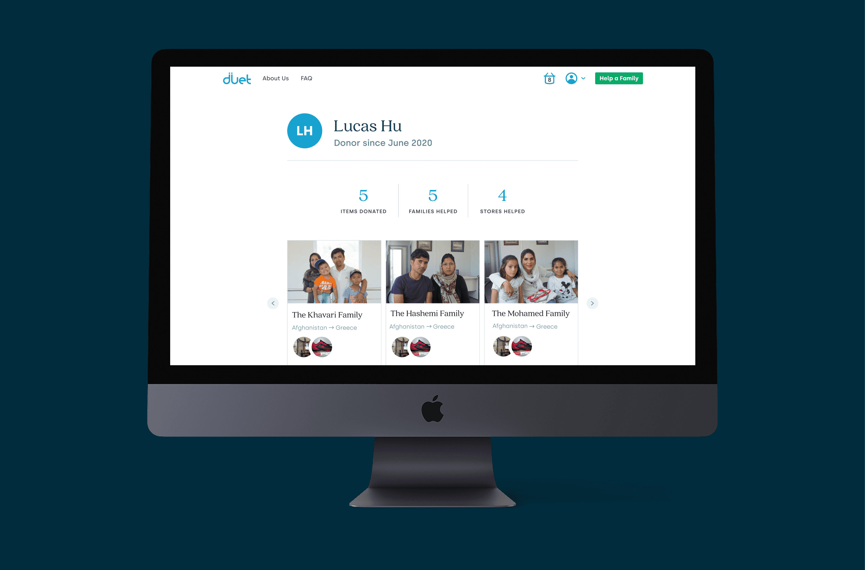
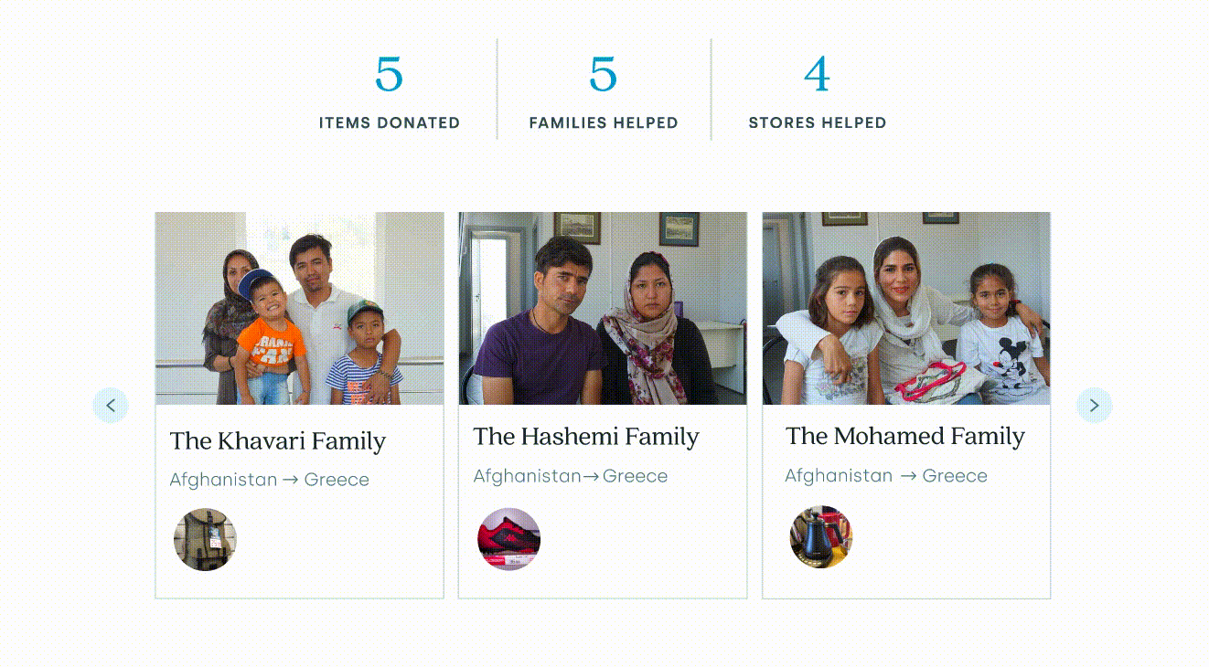
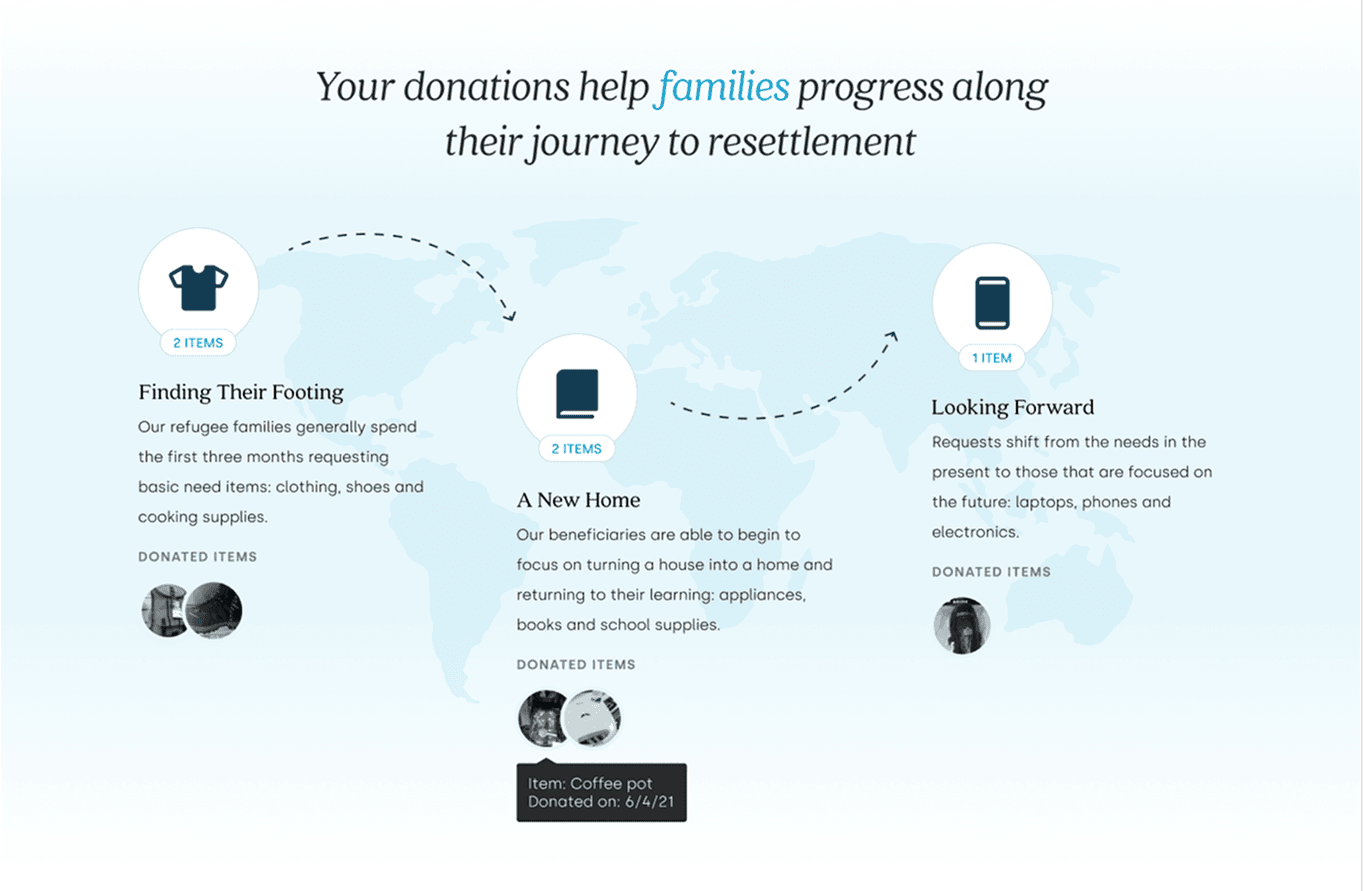
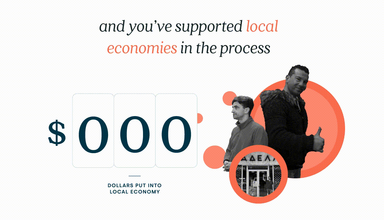
Design solution
The impact page lives on the donor's individual profile, providing transparency in 3 keys features. Donors can swipe through the carousel to see the families they've donated to and the items given. The map progress bar categorizes items into distinct parts of the refugee journey where the items might be most useful. Finally, donors can see their economic impact on local communities. The more donors gives to Duet, the more this page grows.

Learnings
After completing this project, I learned how to effectively craft a narrative through design. Through data and visuals, I showed the complexity of the refugee journey. On the other hand, donors now understood their role as individuals participating in a wave of social good.
Learnings
After completing this project, I learned how to effectively craft a narrative through design. Through data and visuals, I showed the complexity of the refugee journey. On the other hand, donors now understood their role as individuals participating in a wave of social good.
Learnings
After completing this project, I learned how to effectively craft a narrative through design. Through data and visuals, I showed the complexity of the refugee journey. On the other hand, donors now understood their role as individuals participating in a wave of social good.
[Next Project]
Amazon Music Stories

[Next Project]
Amazon Music Stories
[Next Project]